Creating heat maps of git commits
Tags: projects, programming
As a parting graduation gift, friends and I recently decided that we wanted to create a “heat map” of the git commits of one of our mutual friends. Since this was a rather fun hack, I decided to share the script I wrote for this purpose (thanks to Jan for providing the initial script which kicked this off):
#!/usr/bin/env python3

import argparse
import datetime
import subprocess
import os
import sys

parser = argparse.ArgumentParser(description="Create heatmaps of git commits")
parser.add_argument("--author",  help="Author whose git commits are to be counted", type=str)
parser.add_argument("directory", help="git directory to use", metavar="DIR")

arguments = parser.parse_args()

directory = os.path.join(arguments.directory, ".git")
author    = arguments.author or ""

commits   = subprocess.check_output( ["git", "--git-dir=%s" % directory,
                                             "log",
                                             "--pretty=format:%ct",
                                             "--author=%s" % author ] )
counts = [ [0]*24 for _ in range(7) ]

for commit in commits.decode().split():
    d   = datetime.datetime.fromtimestamp(int(commit))
    row = d.weekday()
    col = d.hour

    counts[row][col] += 1

print('set size ratio 7.0/24.0\n'
      'set xrange [-0.5:23.5]\n'
      'set yrange [-0.5: 6.5]\n'
      'set xtics 0,1\n'
      'set ytics 0,1\n'
      'set xtics offset -0.5,0.0\n'
      'set tics scale 0,0.001\n'
      'set mxtics 2\n'
      'set mytics 2\n'
      'set grid front mxtics mytics linetype -1 linecolor rgb \'black\'\n'
      'plot "-" matrix with image notitle')
for row in range(7):
    for col in range(24):
        print("%d " % counts[row][col], end="")
    print("")
print("e")
Note that the numerical values on the y-axis of the heat map refer to the weekdays. I have not provided a mapping to their names. The x-axis refers to the hour in which a commit was made.
The usage is very simple: Point the script towards a directory that contains a git repository, use
the optional --author parameter to filter commits, and pipe the output into a file. The script
will generate code for further processing with gnuplot. A basic session might
look like this:
$ ./git-heatmap.py ~/Projects/Skynet > skynet.dat
$ gnuplot
gnuplot > set terminal png
gnuplot > set output "skynet.png"
gnuplot > load "skynet.dat"
gnuplot > set output
$ # Post skynet.png on all the media to get spared when the
$ # inevitable robot uprising starts...
For further customizations, I recommend Anna Schneider’s ColorBrewer colour palette for gnuplot.
Here’s a heat map of the commits for Scifer, our research group’s visualization framework:
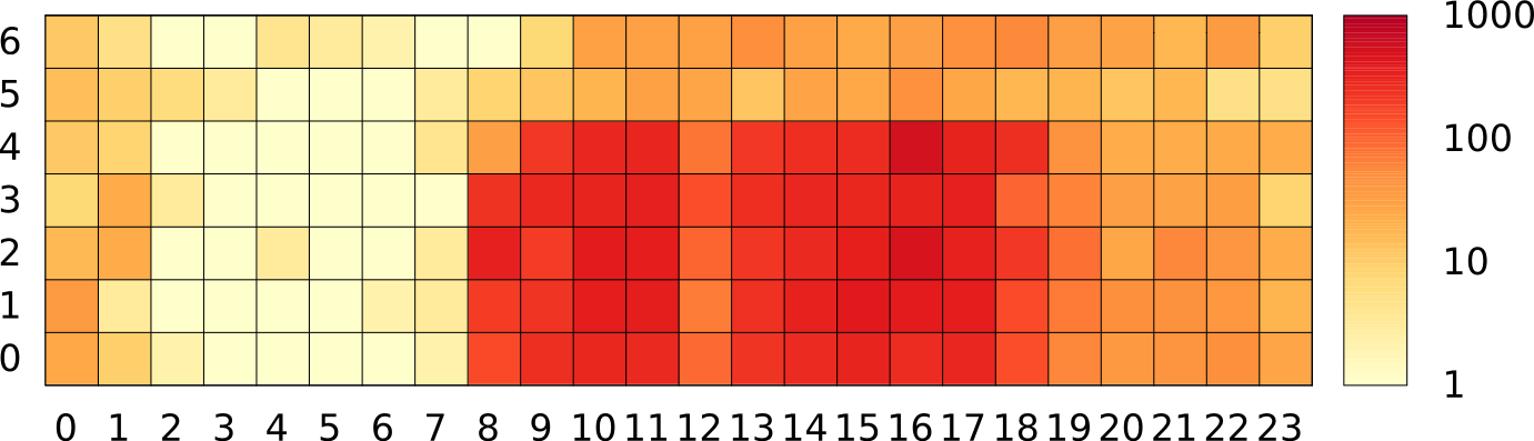
You can see that people check in stuff at all hours. The largest amount of commits still happens during regular business hours, though. Note that the scale is logarithmic to ensure that the few commits during irregular hours are not overshadowed.